

Quick look: Learn more about how the OCDE logo nods to a foundational piece of California’s history: The El Camino Real.
Ever wondered about the history and meaning behind the Orange County Department of Education logo?
More than likely, the answer is no. And that’s okay. Afterall, what could possibly be so special about an old bell?
Turns out, it’s more interesting than you’d think.
Bells have become closely associated with education, largely because early schoolhouses used them to call students to class. While the OCDE bell nods to that tradition, it mostly draws inspiration from the distinctive El Camino Real bells with their shepherd’s crook design that mark the historic El Camino Real.
If you’ve forgotten your California history, the El Camino Real is the 600-mile route trailblazed by Franciscan friars in the mid 1700s along the California coast to travel from each of the 21 California missions. Starting in San Diego and ending all the way in Sonoma, the path is considered the state’s first highway.
While the exact route is still debated, its significance to California’s history is not — which is why in 1906, the Women’s Club of California agreed it was time to mark the highway and cement its legacy, according to historian Max Kurillo in “El Camino Real Bells – California’s Gold.” After much discussion, Harrey Forbes — one of the club’s members — decided on a bell hung from a “staff” similar to one that the friars would have used while traveling to and from missions.
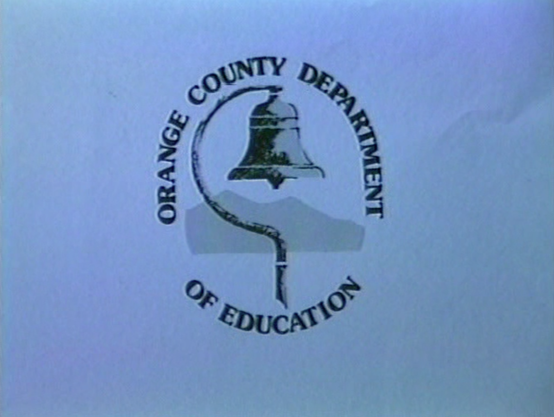
Instead of outsourcing the work, Forbes bought a bell foundry and made the bells herself — designing them, forming the molds and pouring the metal by hand. At their peak in the 1940s, roughly 400 lined what is believed to be the El Camino Real route.
Then, some time in the 1970s, one more bell found its way into the OCDE logo, along with the Santiago and Modjeska Peaks of the Saddleback Ridge. No one knows exactly when the logo was first created or who originally drew it — logos were hand-drawn back then — but over the years, it has become the steadfast symbol of OCDE.
Steadfast … but not entirely immune to a bit of an update.
Soon, OCDE will unveil its new website, and along with it a revamped version of the logo featuring a refreshed color palette. Nothing too dramatic — just a modern touch to accompany the department’s new digital home.
Hopefully, no one is sent into a panic because of this major development. But now if anyone asks, you know more about the OCDE logo than you probably ever expected to.