
Local schools and districts can find out today how well they performed in the state’s newest school accountability system, the California School Dashboard.
The online tool was introduced this year to offer parents, educators and the community a more comprehensive look at how our K-12 schools and districts are educating and supporting students.
The dashboard consists of multicolor pie charts aimed at showing how schools performed in key indicators, and how much progress they’ve made in these areas over time. It also offers detailed analysis for student subgroups that include low-income students, English learners, students with disabilities and other racial and ethnic groups.
“The California School Dashboard underscores the commitment to accountability and transparency by consolidating a comprehensive set of metrics on one site,” Orange County Superintendent of Schools Dr. Al Mijares said. “In addition to displaying critical academic performance data, the dashboard spotlights other important contributors to educational achievement, including school climate and parent engagement, enabling stakeholders to fully evaluate how local schools are preparing students for college and careers.”
The Orange County Department of Education created the brief video above to help parents and others navigate the dashboard. And here are a few more things you might want to know before diving in:
The new dashboard is aligned with California’s academic standards, but it goes way beyond test scores.
Published online, the California School Dashboard features an array of data to help parents, educators and the public evaluate the strengths and challenges of their schools and districts. The dashboard will also help determine which schools and districts require special assistance.
You might remember the old Academic Performance Index, which annually assigned each school a triple-digit score based largely on its standardized test scores. The California School Dashboard uses color-coded pie pieces and other gauges to present a more comprehensive set of metrics. While it will likely take a little more time to grasp, it’s expected to be more useful than the API to parents, educators and the public.
The dashboard is based on state and local performance indicators that might look familiar.
Rather than relying on a single number, the California School Dashboard displays scores based on several state and local indicators. These indicators are specifically aligned with 10 priority areas spelled out in the state’s overhauled funding formula. (The same priority areas are also embedded in the local accountability plans that are updated annually by districts and charter schools.)
The state indicators are:
- Chronic absenteeism
- Suspension rate
- English learner progress
- Graduation rate
- College and career
- Academic (English language arts and math)
State indicator results are based on how schools or subgroups performed overall (known as their “status”), as well as how much they improved or declined over a three-year period (referred to as “change”).
The local indicators are:
- Appropriately assigned teachers, access to curriculum-aligned instructional materials and safe, clean and functional school facilities
- Implementation of academic standards
- Parent engagement
- School climate
- Coordination of services for expelled students (This applies to county offices of education only.)
- Coordination of services for foster youth (Again, this is just for county offices of education.)
Unlike the state indicators, local indicators are self-reported by districts and county offices based on locally available data.
The California School Dashboard relies on visual graphics to show performance and growth.
For the state indicators, color-coded pie pieces represent school and subgroup performance levels. Ranked from least favorable to most favorable, the performance levels are red (one slice), orange (two slices), yellow (three slices), green (four slices) and blue (a full pie).
You can learn more about how each color is assigned by visiting the California Accountability Model & School Dashboard webpage, but the general idea is that the colors are gauges that show how well the school or subgroup performed overall (status) and how much it improved or worsened over a three-year period (change). Here’s an example:
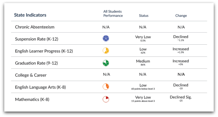
So, the imaginary school above would have boasted favorable suspension and graduation rates while producing low English scores and very low math scores.
Again, the scores above are for the state indicators. The local indicators are represented differently. Rather than using color-coded pie pieces, the dashboard notes whether each local goal has been “met,” “not met” or “not met for more than two years.”
It’s not just a tool for parents and the public. The California School Dashboard also serves as the basis for technical assistance.
Under the provisions of the Local Control Funding Formula — that’s the state’s K-12 funding mechanism — schools and districts will be eligible for technical assistance from their county office of education if certain performance benchmarks are not met over time. To learn more, refer to page 70 of the CDE’s Technical Guide for New Accountability System (PDF).
The state has published guides and other resources for those who want to dive a little deeper — and additional resources are coming.
Again, there’s a lot to digest here, and we’ve just covered a few of the basics. For those seeking more information, the California Department of Education has compiled a bunch of resources, including:
- California School Dashboard homepage
- California Accountability Model & School Dashboard overview
- California School Dashboard video (produced by the California Department of Education)
- Technical Guide for New Accountability System (PDF)
- Quick Reference Guide for California’s New Accountability System (Word doc)
- Frequently asked questions